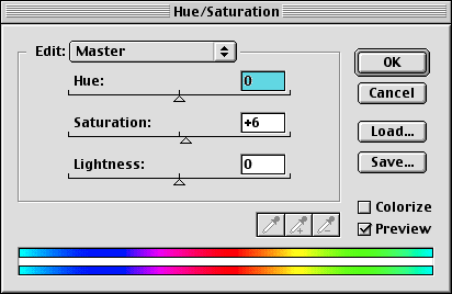
Hue and Saturation
Occasionally I use the hue and saturation box for getting a bit more color into the image (there is actually a better way which we will use as the final step)

- Make a new Hue and Saturation adjustment layer in the layers palette (icon shown above).
- Shift the hue slider slightly to the right and left, sometimes a slight, overall hue shift can make a subtle improvement.
- Increase saturation to taste. I tend to like my images oversaturated, what can I say, I like the colors.
|
indeed they do look the same (the change was more obvious before I shrunk the image down and threw away 50% of the rest of the picture).
|